How to draw a flowchart
Creating diagrams that look professional is easier than you may think. You don’t need to be a graphic designer for that. The trick is to follow certain practical guidelines. We will go over these guidelines here, but you need not remember them by heart. DrakonHub ensures that most of these guidelines are enforced automatically as you draw.
These best practices are the foundation of the DRAKON visual language.

Start with a proper name
Before you begin drawing, think of a proper name for your diagram. The name should accurately reflect the purpose of the algorithm or procedure. It should be as short as possible, but not too short. Do not lose the meaning.
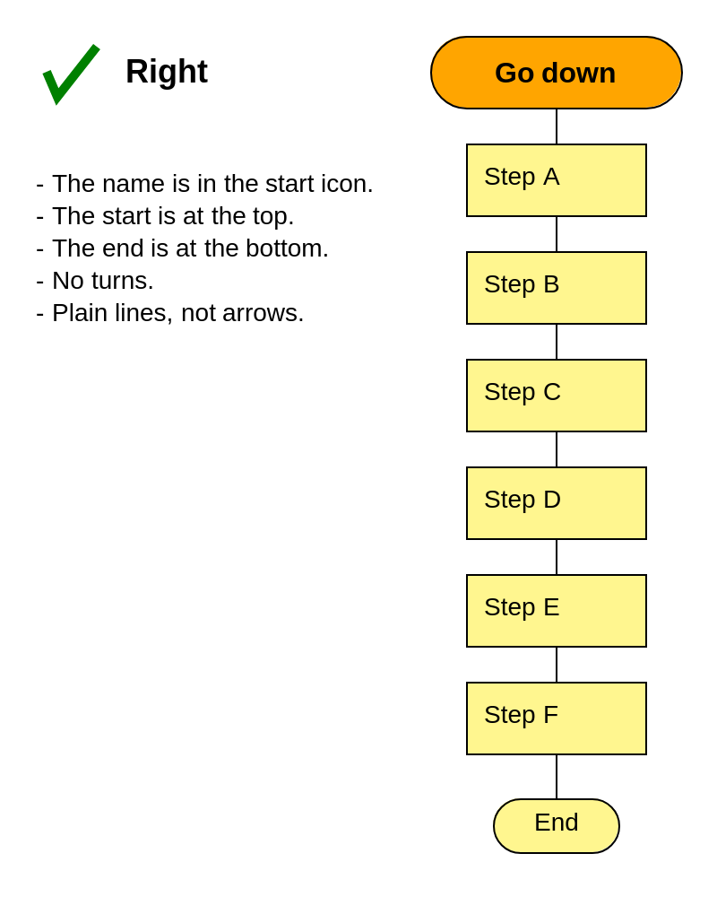
Put the start at the top
Place the start icon at the top of the diagram. This is the first place where the reader will look for it. Let us not waste the reader’s time and give them what they expect.
The start icon should contain the name of the diagram. It should not be the word “start” or even “start here”.
There is only one end
The diagram must have only one end icon. The end icon must be placed at the bottom of the diagram. Provide the reader with some assurance: no matter what happens in the diagram, everything will end right where it should.
Put the word “End” in the end icon. Give a clear signal to the reader: it’s over now. Do not put the last action in the end icon, or the name of the procedure that follows this one.
Go down
The execution flow of a flowchart should move from the top to the bottom. This direction is the most convenient, as people are used to reading text documents in this way. And also, moving down is just natural on planets with gravity.
Avoid turns
The only situation in which our lines can change direction is when decision making is involved. When we have to choose between several paths, these paths need to first split up in different directions and then merge back together. That, of course, involves turns.
When there is no decision to make, do not turn. Go down.
When there are decisions involved, minimize the number of turns.
Do not let lines intersect
Every time your eyes come across a line intersection on a flowchart, your brain tries to figure out whether there is a connection between these lines. This creates a significant stress on the brain. All attempts to make intersections look less ugly have failed.
The only way to avoid this unnecessary stress is to do away with line intersections.

Replace arrows with plain lines
In the past, flowcharts used to be all about boxes and arrows. This is not the case anymore.
In the modern DRAKON flowcharts, plain lines have replaced arrows. Why is that, you ask? While there is nothing wrong with boxes, arrows indeed pose a problem. Arrowheads are visual objects that add to the complexity of the diagram. The purpose of an arrow is to point to the next icon on the diagram. If you adopt the convention that icons follow from top to bottom, there remains no need for arrows at all! The next icon is always below the present one.

There is only one situation in which the following icon is placed above the current one. It is possible when we have a loop. Only then, it makes sense to use an arrow.
This way, loops become easier to spot on a flowchart: just look for arrows!

Use only straight vertical and horizontal lines
Curved lines may be appropriate in design, but in business graphics, they are toxic. Here is why. Our brain considers straight-line segments to be simple primitives. We can easily see which two objects are connected with a straight vertical or horizontal line segment.
It is different for curves and slanting lines. To understand which objects are connected, the eye has to carefully trace the curve from the source to the destination. This creates unnecessary tension inside us and is time-consuming. Here is an example that shows how nice straight lines are in comparison with curves.
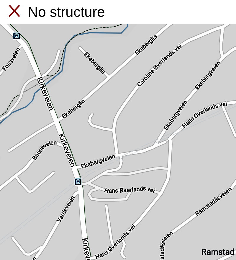
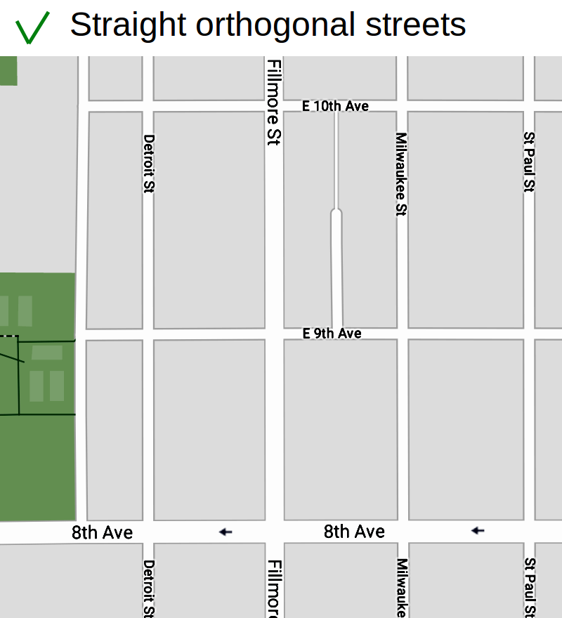
The area with straight streets and rectangular structure is obviously easier to navigate.
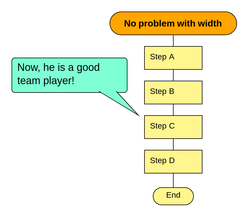
Make sure consecutive icons have the same width
When icons in a vertical sequence have the same width, they are perceived as a group. Our eyes scan them faster. But if they have different widths, the feeling of smooth transition from one icon to another is lost.
When an icon has a different width, it gives a signal. Do not give the reader false signals.

Create equal spacing between neighboring elements
What is “metre”? In poetry, metre is a basic rhythmic structure of a verse.
In graphics, metre is a rule that prescribes the maintenance of the same distance between two neighboring elements. Metre is a simple trick, but its positive effect is enormous.


Send branching to the right
We have agreed that our flowcharts will run from the top to the bottom. This leaves only two directions for additional paths that begin at points of decision making: left and right. Apparently, sticking to only one direction pays off.
Ensure that additional paths branch out only to the right. This rule adds a lot to the predictability and consistency of our diagrams. And consistency is paramount for clarity.
The reader need not scan the diagram in order to find where the additional path goes. They already know that it goes to the right. The reader expects it there and finds it there.
This little trick saves a lot of effort. Instead of having to analyze the structure of the diagram first, the reader skips directly to its content.
The further to the right, the worse it is
Not all paths through a flowchart are equal. Usually, there is one path that is the most successful. It is called “the happy path”. Other paths are somehow worse, depending upon the context. In programming, certain conditions can lead to errors and failures. In medical procedures, there are cases when the patient dies.
In some algorithms, it is difficult to say whether a specific outcome is better or worse. In such a case, the happy path is the most probable scenario.
Here is an easy way to highlight the happy path on a flowchart. Lay out the flowchart such that the happy path goes down the main vertical line. This main vertical with the happy path is called “the skewer”.
When there are more than two ways through a flowchart, arrange the branches from left to right according to the principle that the further to the right, the worse it is. The happy path will be on the leftmost vertical; the worst case scenario will be on the rightmost one. All the other paths will go somewhere in the middle.
The readers who only want to know the happy path do not need to study the whole diagram. They can just take a glance at the leftmost part of it.

Common fate
Very often, we need to perform some action in different ways, depending upon certain conditions.
For example, if we have a diesel car, we must refuel it with diesel. If we have a car with a conventional engine, we must fill the tank with gasoline. If we have an electric car, we must charge the battery.

Here, the action that is performed differently is refueling. We can indicate to the reader that actions that are placed on different paths are related. In order to do that, we align the corresponding icons with the same horizontal line. This trick is called “common fate”.
Common fate can also be used to ensure that some critical action is taken in any case. In our example, we make sure that the car is supplied with energy, regardless of the engine type.
Silhouette
A silhouette is a diagram that consists of several flowcharts. The silhouette reminds one of mind maps in a way. It breaks up the problem into logical parts. These parts are called “branches of the silhouette”. Each branch is a small separate flowchart with its own name. The footer of the branch has a reference to the next branch. The branches of the silhouette follow from left to right, but exceptions may exist.

A silhouette diagram relies on the divide-and-conquer strategy. Instead of one large messy flowchart, we have several little and tidy ones. There can be many sub-diagrams inside a silhouette. And yet, its design ensures that the diagram is perceived as a single whole. The silhouette is extremely useful, as it allows us to display a complex procedure in one visual scene. To learn more about the silhouette, watch this video.
Many small improvements together create a huge difference
The guidelines described in this article are effective methods that improve the readability of diagrams. Even though none of these rules appear very dramatic individually, together they add up to a major change.
Thanks to the cumulative effect of these guidelines, diagrams gain a totally new level of consistency and clarity. You can now access a new road for your visual thinking.